
Now that we have a good understanding what some of these basic web metrics are all about, let’s walk through a case study example of using these analytics in action.
For the purpose of this chapter, we’ll be using Google Analytics as our platform. Please note, there are a ton of great resources available for how to use Google Analytics. We will not be covering in-depth how the platform works, as that content is already well documented. However, we’ll be showing how the tools can give you invaluable insights into your online marketing efforts.
BuyMoreSunglasses.com
A quick technology review:
We have built our site on a Content Management System (CMS). Let’s say, we went with WordPress because the handy plugin ecosystem ensures we can drop in the analytics tracking code on every page. This ensures are current and future pages will be tracked. Or put another way, there is a phone booth on every corner for placing and recording calls.
Background:
The OnDigitalMarketing.com website was built as a quick brochure site to serve as a repository for content taught for classes at Montana State University. It has had very little care and feeding to date, which is why it makes a good example for our purposes. Most digital properties tend to fall under this approach. Site was designed, launched, and then ignored.
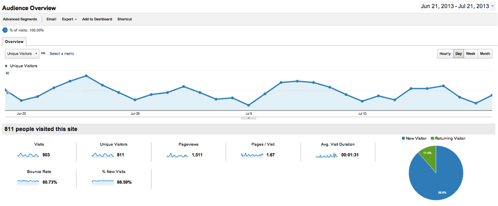
We log into our dashboard and see the snapshot posted above.
Let’s Break This Down Step by Step
First up, we see that the default time period is for the last 30 days when we log into Google Analytics. Let’s change this to compare year over year for the past years for OnDigitalMarketing.com. This can easily be changed and as you have more data on your web property you want to look at monthly or yearly blocks of time. By analyzing year over year for an extended period it’s possible to better understand traffic trends from a big picture view.
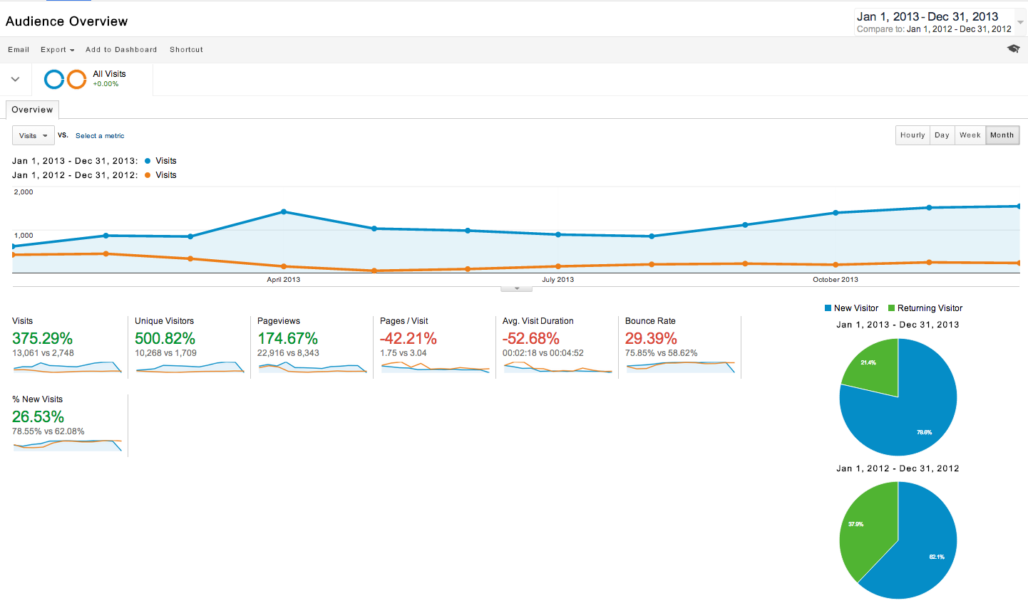
Next, we start to see where our true work lies. While we have 10K Unique Visitors (500% jump from previous year) that spent an average of 2:18 on the site (down almost 50% compared to previous year). However, our Bounce Rate is at a whopping 75%. The Pages per Visit shows 1.75, so this starts to suggest that most of our traffic is reading just one page and leaving – which is very typical for a blog style website like OnDigitalMarketing.com.
Note: If the visit duration were less than 15 seconds, it would suggest that the user is finding absolutely no value on that page. This is somewhat good news.
So, users are finding value on one page (most likely) but they are not digging into other content on the site. This is bad news.
On a bright note, the new visitors make up almost 89% of the traffic. However, the trendline icon to the left shows this being pretty consistent over the last month, so we are not really growing – at least in the last month – again, a reason why we would want to look at month over month for a last year or so.
What we know about site performance from this very quick snapshot:
- The site pulls in fresh visitors. (75% of traffic is New Visitors)
- They read about a page or so. (Average Pages/Visit is 1.75)
- We fail to get them to look at different parts of the site. (Bounce Rate is consistently 75%)
Now, we have a better idea of what the problems are. Not unlike a patient who shows up at the hospital with a high fever and weird skin color, we have to start running more tests to better understand where the problems lie with our web property.
Key Takeaway: The above example shows what has happened on our digital property. However, it does nothing to explain why it happened. Why is our Bounce Rate so ridiculously high? How come 9 out of 10 users are new? Why do they only find one page valuable? Finally, implicit in all of this is the time frame of yearly data sets. We are discovering clues but no real culprits.