Sherlock has Watson.
Mario has Luigi.
Peanut butter has jelly.
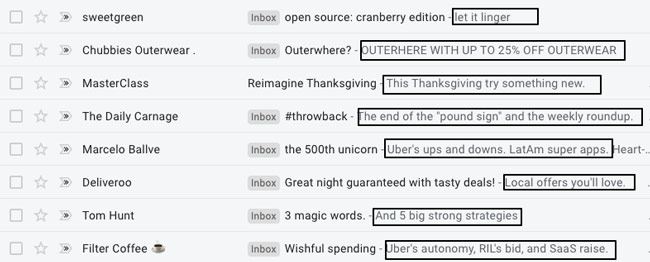
For higher email open rates, you also need a dynamic duo: specifically, snappy subject lines and powerful pre-headers.
While much emphasis is placed on subject lines, a well-written pre-header further entices a reader with a sneak peek into your value prop.
After all, who wouldn’t be interested to learn the answer to a thought-provoking subject line like.
“How did we nurture an inclusive work culture?” or a hinting pre-header such as, “A dating app helped?”
Insights like these keep us excited about internet marketing at OnDigitalMarketing. They inspire our mission to help aspiring entrepreneurs and online marketers discover the immense potential of digital media.
As such, we’ve collated more information on email pre-headers to help you achieve better user engagement and higher open rates. As we delve into these ideas, you’ll also discover:
- Best practices for creating effective pre-headers
- Common mistakes to avoid when crafting email pre-headers
- Real-life examples of effective email pre-headers
- How to conduct an A/B test on email pre-headers
- How pre-headers influence user journey and brand growth
But first, why you should be hyped about email preheaders.
1 – Importance of Email Pre-headers

Email marketing is one of the most effective digital marketing channels for businesses to engage with their audience. However, it can be challenging to cut through the clutter of emails in people’s inboxes without pre-headers.
They serve as one of the first points of contact between your email and the recipient, appearing immediately after your subject line.
This makes them especially crucial for the six-second window readers take to open an email, where they provide insight into your value prop.
Essentially, your pre-headers help answer the question, “Why open this email?”
Here’s an excellent example of Marketing Mastery using their pre-header to entice a reader:
Subject line: Jen boosted her conversions by 84%
Pre-header: Want to know how she did it?
Marketing Mastery’s subject line provides the initial hook regarding boosted conversions. They follow this intrigue up with an enticing offer to teach the reader more about boosting conversions through a well-crafted pre-header.
Pro Tip: Use a concise email pre-header to help readers understand the value of opening your email.
2 – Best Practices for Email Pre-headers
“Email has an ability many channels don’t: creating valuable, personal touches—at scale.”
— David Newman
With better engagement and higher open rates at stake, what are the best practices for email pre-headers?
- Concise Messaging: Remember the six-second window? You don’t have much text to spare either, typically between 30–80 characters, so you need to make your point quickly and help the reader understand the benefit of your email at a glance.
- Keep the mobile user in mind: Considering that 65% of email opens are on small-screened mobile devices, your email pre-header needs to be mobile-friendly, which reinforces the need to be concise and conservative with text length.
- Personalization: For email marketing in general, make sure your content feels personal to boost engagement and read-throughs. For your pre-headers, personalization grabs your readers’ attention and encourages them to open your email when they feel it’s addressing them specifically.
- Calls-to-action: Sometimes getting people to act is as easy as just asking them. This makes it essential to have a clear CTA in your pre-header to encourage users to engage with your brand beyond just opening the email.
- Curiosity: Remember Marketing Mastery’s subject line, “Want to know how she did it?” We humans are naturally curious, and passing up such an offer is difficult. This presents an opportunity for your pre-header to leverage curiosity for higher open rates.
- Incorporating branding: You’re going to be sending a series of emails, so it’s important that your audience recognizes your brand within the six-second window to encourage opens. This entails using your brand’s colors, logos, and other visuals in your pre-header design.
Bonus Idea: Use A/B testing and web analytics to guide your implementation of these best practices into your pre-header design. For instance, find out how many of your readers use mobile devices, and which are the best forms of personalization for your audience.
3 – Avoiding Common Mistakes With Email Pre-headers
Clickbaits or misleading pre-headers stand out as the most frequent blunders in digital marketing.
They often do an excellent job at enticing users into clicking your emails and joining the subscriber list, only for them to quit soon after. They then proceed to report a negative user journey from your emails, tainting your brand as a spammer.
Your open rates then soon plummet.
Luckily, all you need to do to avoid this fate is to simply deliver on your claims and value propositions. This enables you to harness the promotional benefits of physiological triggers and enjoy brand growth with positive reviews of delighting users.
An excellent example of this is a pre-header from Peet’s Coffee.
Subject Line: Introducing Members-Only Menu
Pre-header: You won’t find these anywhere
The pre-header elicits a sense of urgency and Fear Of Missing Out (FOMO) that encourages the reader to click on it. And their claim of exclusivity isn’t over the top because it’s truly a Peet’s Members-Only menu, which they proceed to share in the email.
Another common mistake for email pre-headers is exceeding the recommended maximum length of 80 characters.
This does little to entice readers who have only six seconds to decide on opening an email. Chances are they won’t even finish your pre-header before simply ignoring you along with the other uninspiring emails in their cluttered inbox.
So, don’t let your precious text real estate go to waste. Use your characters conservatively and be as concise as possible. In a nutshell, say more with fewer words.
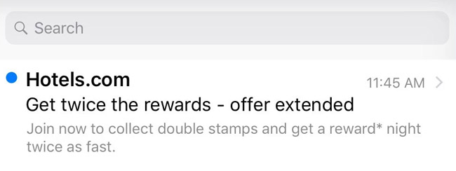
Here’s a perfect example from Hotels.com:

Pre-header: Join now to collect double stamps and get a reward* night twice as fast.
It perfectly summarizes the reward offer for stamps and how joining earns the reader double stamps. It also gives the tip that nights are faster, all while keeping below 80 characters.
It’s an efficient use of text real estate that offers the reader three reasons to click on the email, and is likely to generate high open rates.
So, to avoid common mistakes, incorporate the best practices from the previous section and employ A/B testing and web analytics to guide you. This will help you craft excellent pre-headers for higher open rates.
The following table compares the key engagement metrics between clickbait-style pre-headers and concise pre-headers.
| Metrics | Clickbait-Style Pre-Headers | Concise Pre-Headers |
| Open Rates | Lower | Higher |
| Click-through Rates | Mixed results | Higher |
| Conversion Rates | Lower | Higher |
| Unsubscribe Rates | Higher | Lower |
4 – A/B Testing Email Pre-headers
“Don’t be afraid to get creative and experiment with your marketing.”
— Mike Volpe
Creating effective pre-headers has no one-size-fits-all approach. You need to adapt your design to include the best practice elements that resonate the most with your specific audience.
This is where A/B testing of email pre-headers comes in.

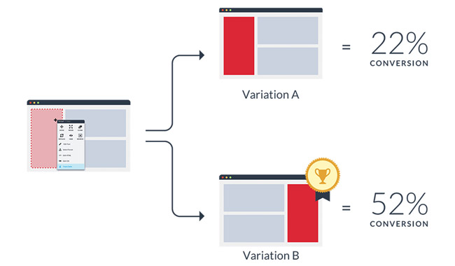
A/B testing allows you to test different pre-header variations and identify what works best for their readers. To do this:
- Send the same email content to your readers with varying pre-headers. For instance, one pre-header with a CTA and another with curious language.
- Compare the performance indicators of each variation, such as open rates and read-throughs, to determine the best pre-header style for your audience.
- Figure out why different pre-headers generate different results by using web analytics and drawing inference. For instance, the various geographical locations of your readers and demographics.
- Create data-driven templates for future email campaigns based on the insights generated from the web analytics.
Implementing A/B testing insights in your email pre-headers not only improves engagement levels and open rates but also helps with SEO optimization.
Expert Tip: Use A/B testing to also improve your email content to enhance read-throughs on top of achieving high open rates from data-driven pre-headers.
Search engines like Google monitor bounce rates and take high open rates as a signal of quality content, which boosts your domain ranking. So, improving your pre-header also benefits your reputation as a website.
Watch the video below to get insights of how Google ranks websites.
5 – Examples of Effective Email Pre-headers
We’ve looked at the importance of pre-headers in boosting engagement and open rates plus best practices for ensuring optimization. Now, let’s borrow a leaf from the pros with these perfectly-executed pre-header examples from their email outlets.
- Jet Blue: “Ready for takeoff? Don’t forget to check in!”
Jet Blue’s pre-header uses a clever play on words to pique the reader’s interest, while also reminding them of an essential action item for their upcoming flight. By incorporating a clear CTA, the pre-header entices users to open the email and take action, ultimately improving user journey and brand growth. - Grammarly: “Spice up your writing with Gingerbread Lattes!”
Grammarly’s pre-header engages users by tying in a popular holiday drink with their writing product. This pre-header personalizes the user experience and entices users to open the email to discover how they can improve their writing process. - HubSpot: “Behind on your work? Let’s get back on track.”
HubSpot’s pre-header acknowledges the user’s challenges and offers a solution. By utilizing a concise message and emphasizing personalization, the pre-header shows that the company understands the user’s needs and offers a helpful solution. - Kind of a Big Deal: 50% off this weekend. But only the first 100 customers.
The pre-header effectively creates a sense of urgency while concisely highlighting their value proposition—50% off for the weekend. This entices readers to act quickly and open the email to learn how to be among the lucky first 100 customers. - MailerCheck: Sign up for free and verify emails in minutes!
This pre-header does a fantastic job of concisely highlighting the value propositions—free sign-ups, and an instant application. It also serves as a CTA that entices readers to take action and open the email.
The table below showcases examples of effective email pre-headers used by different companies to engage their audience and improve open rates.
| Company | Pre-Header Example | Key Element | Impact |
| Jet Blue | “Ready for takeoff? Don’t forget to check in!” | Clever wordplay | Piques curiosity and promotes action |
| Grammarly | “Spice up your writing with Gingerbread Lattes!” | Seasonal association | Personalizes and creates intrigue |
| HubSpot | “Behind on your work? Let’s get back on track.” | Problem-solving approach | Addresses pain points and offers solutions |
| Kind of a Big Deal | 50% off this weekend. But only the first 100 customers. | Urgency and exclusivity | Creates a sense of urgency and exclusivity |
| MailerCheck | Sign up for free and verify emails in minutes! | Clear value proposition and CTA | Highlights benefits and encourages action |
6 – User Journey and Brand Growth Through Email Pre-headers
“Your customer doesn’t care how much you know until they know how much you care.”
— Damon Richards
Beyond improving email open rates, incorporating effective email pre-headers into your email marketing strategy also enhances the overall user journey and promotes brand growth.
A perfect example of this is a pre-header that accurately reflects the content and message of your email. It sets the right expectations for your readers from the very beginning and primes your content for positive reception.
The result is a delightful user experience that fosters trust, where your audience believes what you say, and sets you up for brand loyalty.
Every marketer and entrepreneur understands that your most loyal readers are your best advocates and they’ll help you expand your reach through word-of-mouth.
Therefore, it’s crucial to avoid making over-the-top claims and promises with your pre-headers, and ensure you deliver each time to enhance the user experience and foster brand-boosting loyalty.
Discover More Insights for Your Email Campaign With OnDigitalMarketing

So, that’s the key to higher open rates with email pre-headers.
But there’s still so much to explore about email marketing and we at OnDigitalMarketing would be delighted to share with you our insights.
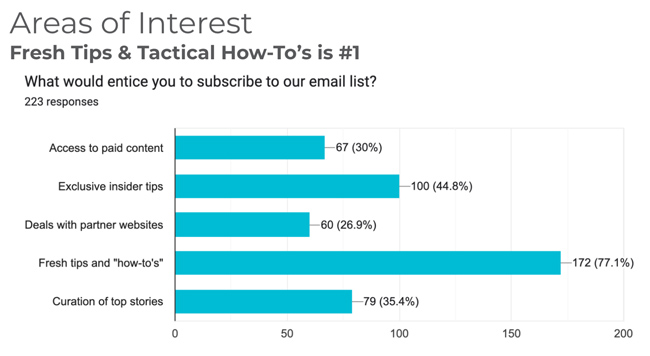
For instance, how do you entice readers to subscribe to your mailing list?
Curated top stories? Insider tips? How-to guides? Deals with partner websites?
77.1% of respondents from our recent survey love signing up for how-to guides.Discover more by signing up for our monthly email today. You’ll also get instant access to our College Textbook for Digital Marketing and Social Media.
