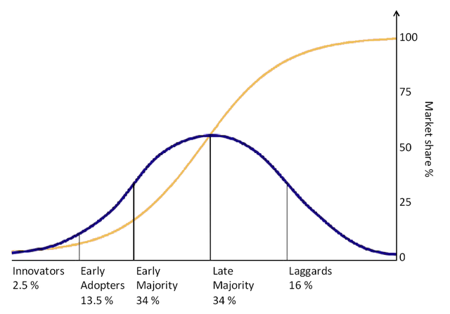
Where blue represents the groups of consumer adopting a new technology and yellow is the market share which obviously reaches 100% following complete adoption. This is the point of market saturation.
Which One Are You?
Bonus: While this research can seem a bit high-level, it has profound real-world impacts on how technology products and services get adopted. Many entrepreneurs and marketers fail to take into account that you must move from left to right in the adoption curve. As a result, they drastically overestimate their market size and how much work and time will go into getting a disruptive idea into the mainstream. For a detailed must-read in this area that builds on Rogers’ research with real-world examples from the tech space, check out Crossing the Chasm by Geoffrey Moore.
