
The Mobile Question
We’ve spent some time going over how to execute a successful website launch. However, in this day and age of mobile connectivity, you may be asking yourself “Do websites even matter anymore?”.
A good question indeed and with the absolute explosion of mobile devices it warrants a good debate.
The answer?
It depends on the business model.
But let’s start with what we can all agree on: mobile represents a radical shift in the consumer experience. When everyday users are empowered with the ability to record, tweet, post, research, and scan the machine that resides in their pocket is unlike anything in the history of humanity.
With the rapid rise of adoption of tablets and smartphones, brands are left trying to navigate this volatile technology landscape. Many in the C-Suite read the industry press and are knocking on marketing’s door with the question, “What’s our mobile strategy?”.
At this point, knowing your customers and how they want to engage with your business is critical. The iTunes and Google Play stores are littered with the bones of iOS and Android apps that have barely been downloaded. Producing these apps is not an insignificant cost or effort either. When the time for creative, development, deployment, and store approval is figured into the equation this represents a huge waste to build a native app that doesn’t get any traction. (A native app is an application you download and install directly on your smartphone or tablet versus using a browser like Safari or Chrome to navigate to a website).
Let’s take apart this native question with a quick example.
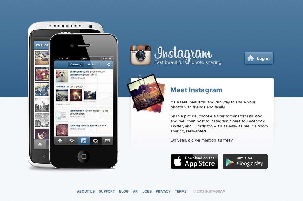
For a Business to Consumer (B2C) brand that requires a user to interact socially and get value via the user’s location, photos, and short bursts of content, a native app makes a lot of sense. Many companies in this space have launched purely on a mobile play. For example, Path and Instagram practically force all their users to download the mobile app before interacting with any of their technology.
As we’ve seen with Metcalfe’s Law, getting adoption and leveraging network effects is a real challenge. These companies absolutely must force users to be on mobile to experience their offerings in the best way. After all, who wants to take photos on their phone, sync with a laptop, apply a photo filter, upload to a digital property, and then geo-tag the location?
Obviously a smartphone removes almost all friction here (and we’re all lazy in the digital world). For companies like Path and Instagram this interaction is the whole basis of their value proposition.
Yet, these are very unique businesses. For a Business to Business (B2B) company selling industrial manufacturing equipment with a long sales cycle, a native mobile app might not make a lot of sense – at least right now.
Regardless, mobile is here to stay and has to be considered into the digital marketing mix.
One possible solution to leverage the gap across desktop and mobile is a framework called Responsive Design. First put forth by Ethan Marcotte while redesigning the Boston Globe website, Responsive Design selectively responds with content to the screen size of the device. This can simplify the management of a digital property, as only one code base needs to be maintained versus having a specific mobile site powered by a separate Content Management System.
Responsive Design shows opportunities for letting users pull up content on their phone that’s been carefully tailored for that experience and device size. After all, do they really want to see your company’s recent tweets when they’re looking for the location of your business standing on the corner of a busy street? However, when they return via a laptop, a more rich experience with multi-media and social feeds might be appropriate.
Tip: Be sure to review your site’s analytics to see what devices users are visiting your website on. Chart this over time. Is it growing? How fast? This can yield clues and help you justify a Responsive Design project redesign.
Key Takeaway: We are still in the early days of understanding the mobile revolution and what it means for brands. However, the digital marketer absolutely must consider what this experience should be for their users. Depending on the business model, a native app may or may not make sense. Responsive Design provides an option for curating the digital experience across all devices.